Type as Form
– Studio Studio
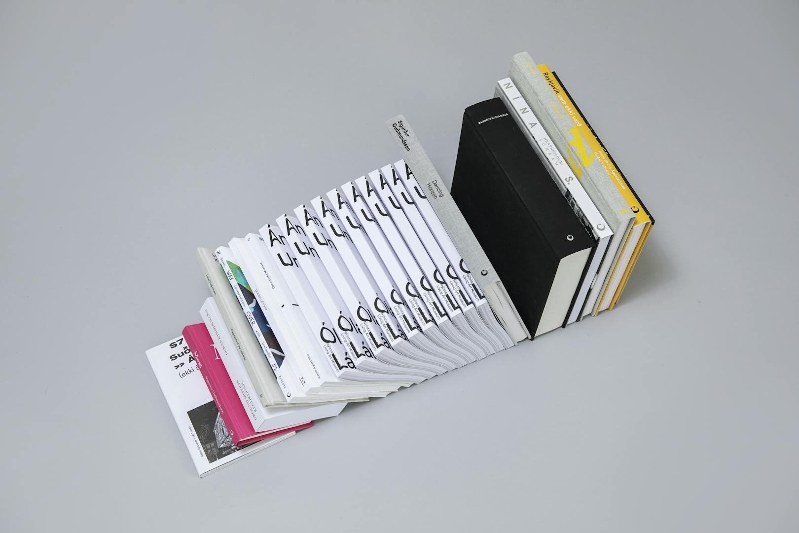
Graphic duo Studio Studio consists of designers Arnar Freyr Guðmundsson and Birna Geirfinnsdóttir. Their main focus is book design, typography, identities and editorial work. In addition, they have taught both abroad and at the Iceland University of the Arts, where Birna holds a post as the programme director for visual communication.
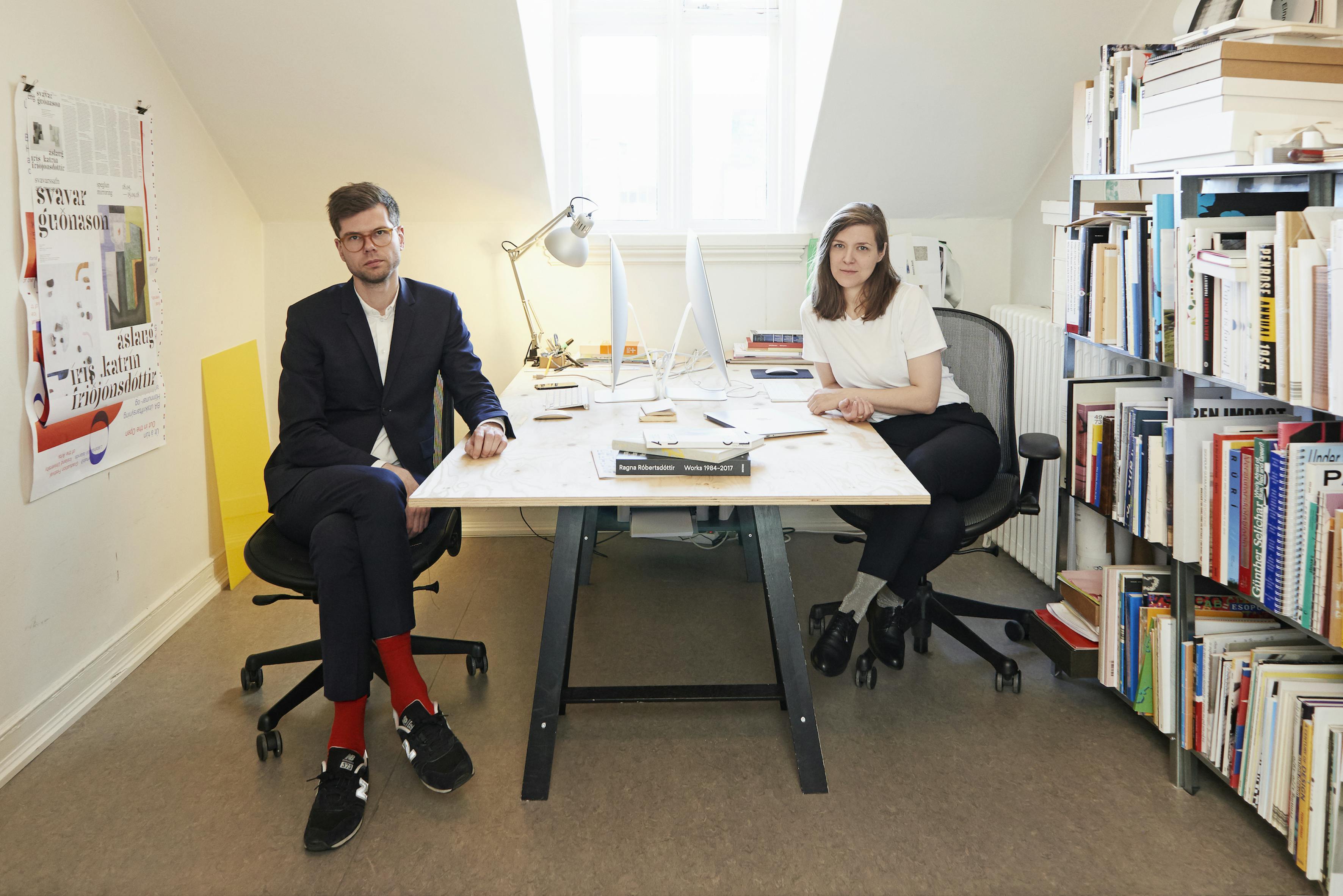
Typography above all else
First published in HA, Issue no.08, 2018
Both Birna and Arnar Freyr studied graphic design at the Iceland University of the Arts and Birna also holds an MA in book design from the University of Reading, in the UK. They have worked on various projects at home and abroad, collaborated on international projects and exhibitions, and most recently they have conducted short courses in Germany. “We are deeply interested in typography and we approach most of our projects typographically. Type can both mediate information in the form of a text and it can also be very illustrative. Therefore, the approach can often be quite abstract,” says Arnar.
Working with texts requires a lot of patience and it is important to understand the purpose and role of the text one is working with. “We try to immerse ourselves in the material. Often there is not enough time to read the entirety of the text, especially if it is very long, but we try to capture its voice, structure and how it is organised and find a suitable solution for it,” says Birna. Both agree that their goal is to bring together craft, ideology and research and that every component of a subject is vital when bringing forth a convincing final product. “Every project requires revision and it is difficult to create a single format that works for a whole project,” says Arnar. “It is of course extremely rewarding to challenge preconceived formats and find new modes of representation.”
The importance of typography is indisputable according to the duo, and Birna elaborates: “Quite often typography gets confused with type design. To explain the difference quickly, typography is designing with type, but type design is, as the name indicates, the designing of typefaces. When you are working on a book that is mostly continuous text, the main focus is on the readability of the text – how easy or comfortable it is to read. How long are the lines? How is the line spacing, is it left-aligned or justified? How are the words divided? What elements in the layout make the text flow with greatest ease? Legibility applies to information one needs to comprehend immediately, on for example signs and labels. Something on a larger scale needs to be legible so you can grasp its message. One should not really notice typography per se.”
We are deeply interested in typography and we approach most of our projects typographically. Type can both mediate information in the form of a text and it can also be very illustrative. Therefore, the approach can often be quite abstract.
The importance of dialogue
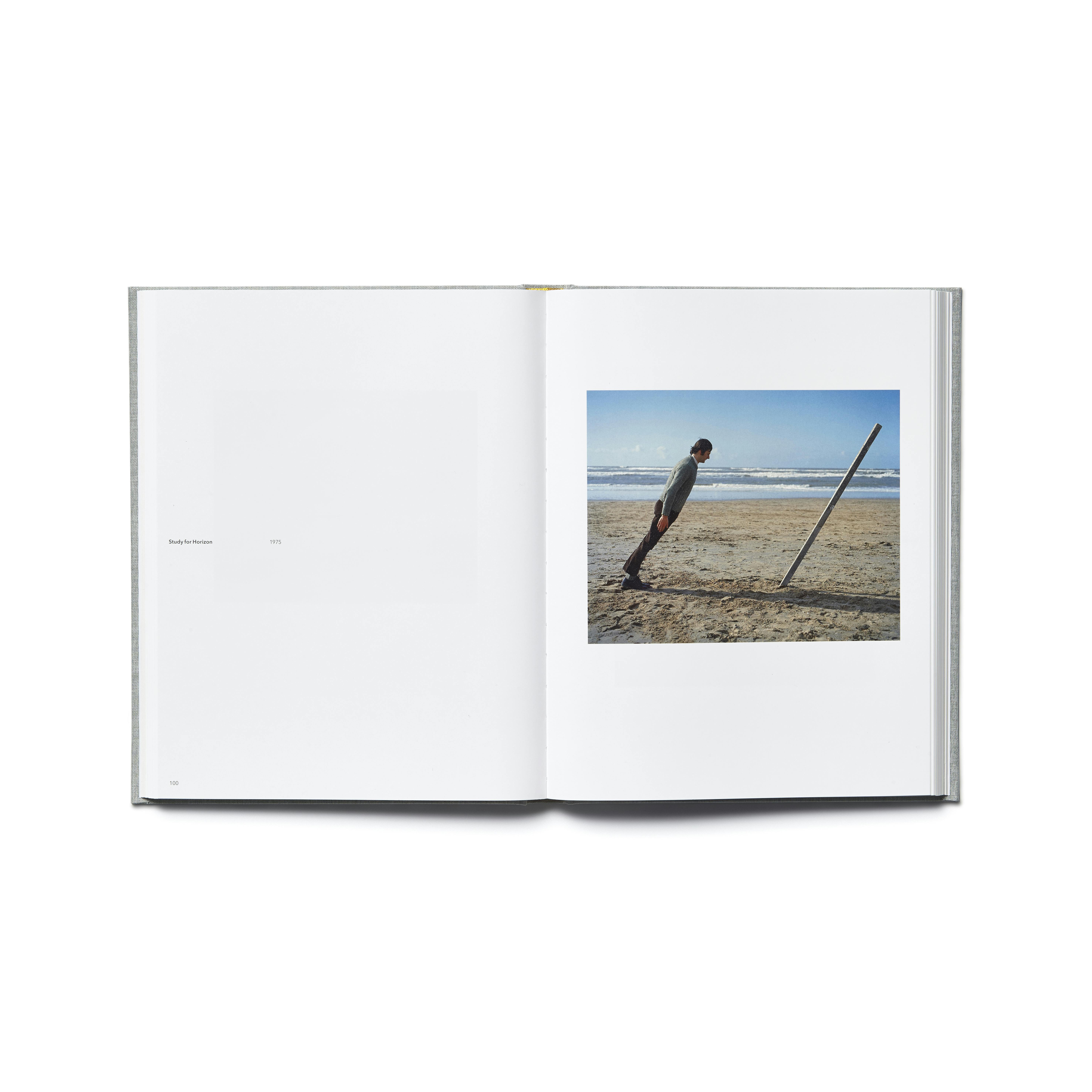
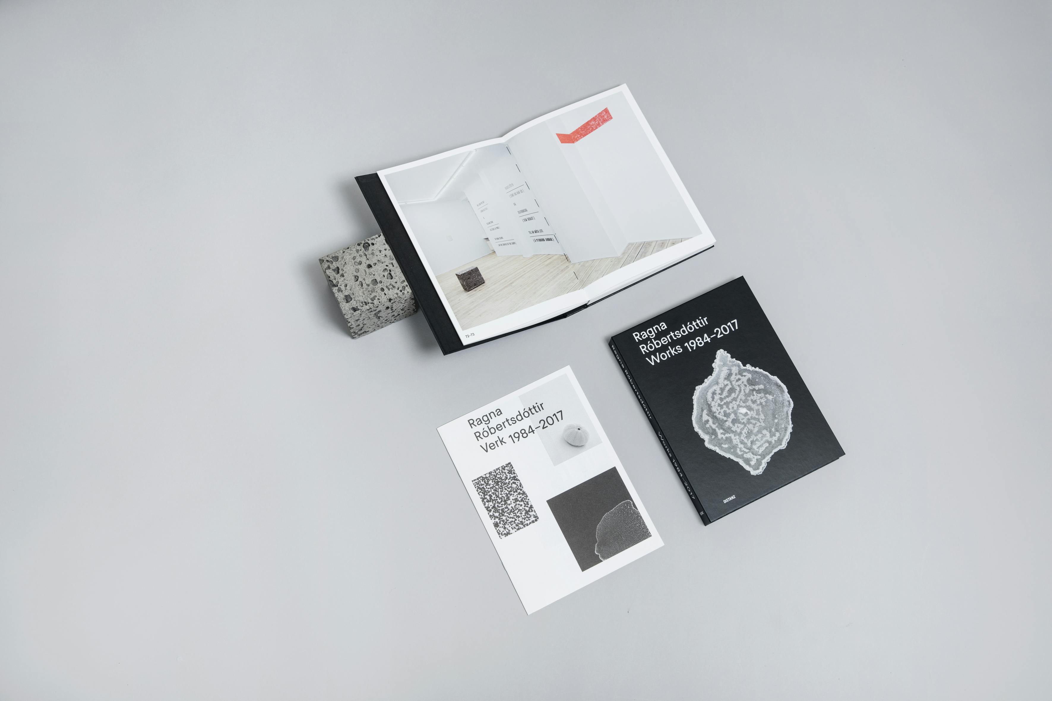
Although the studio’s projects are quite varied, most of their clients are cultural institutions, art museums and artists. Earlier this year, a retrospective book about artist Ragna Róbertsdóttir was published by the German publishing house DISTANZ. The design of the book was done in close collaboration between Studio Studio and Ragna herself.
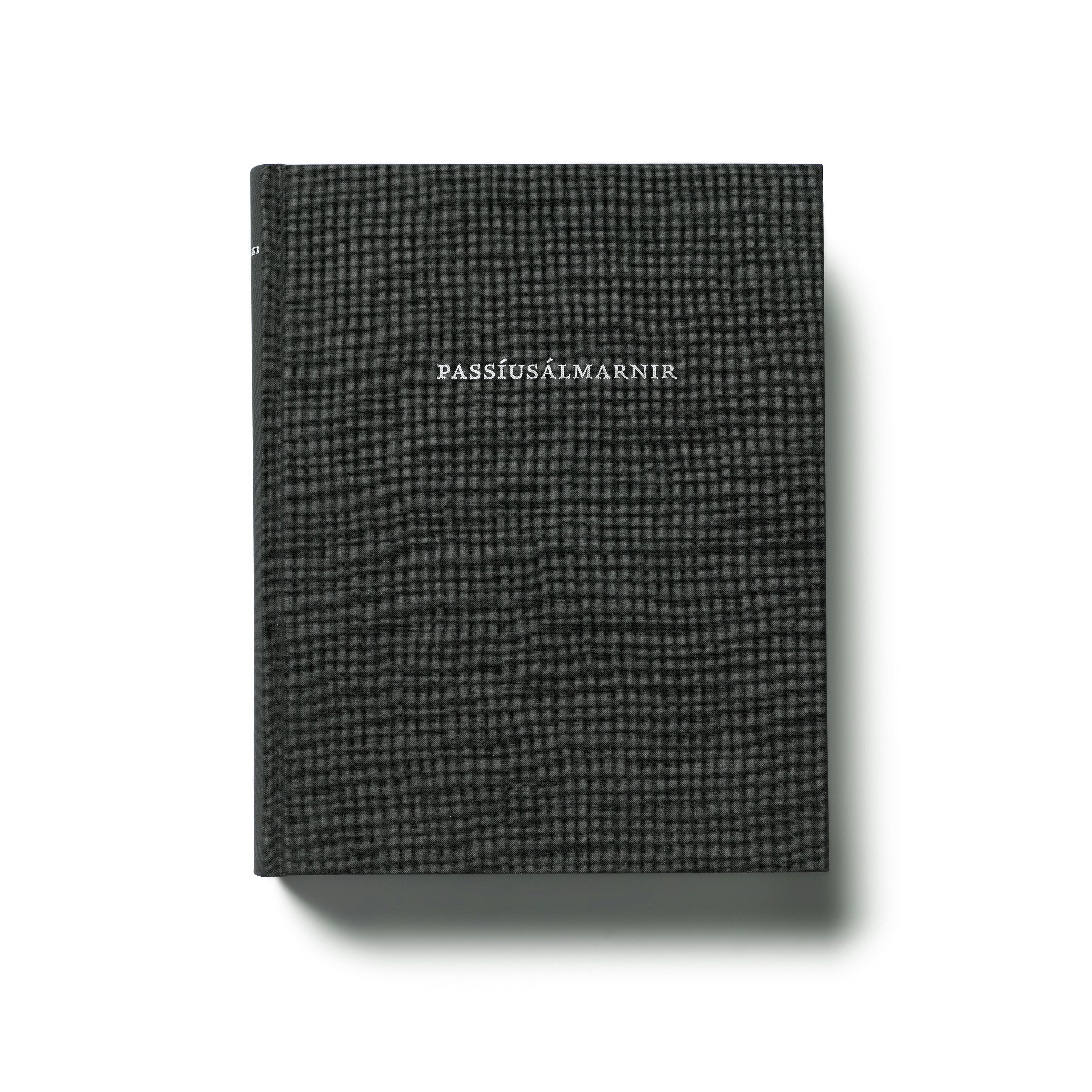
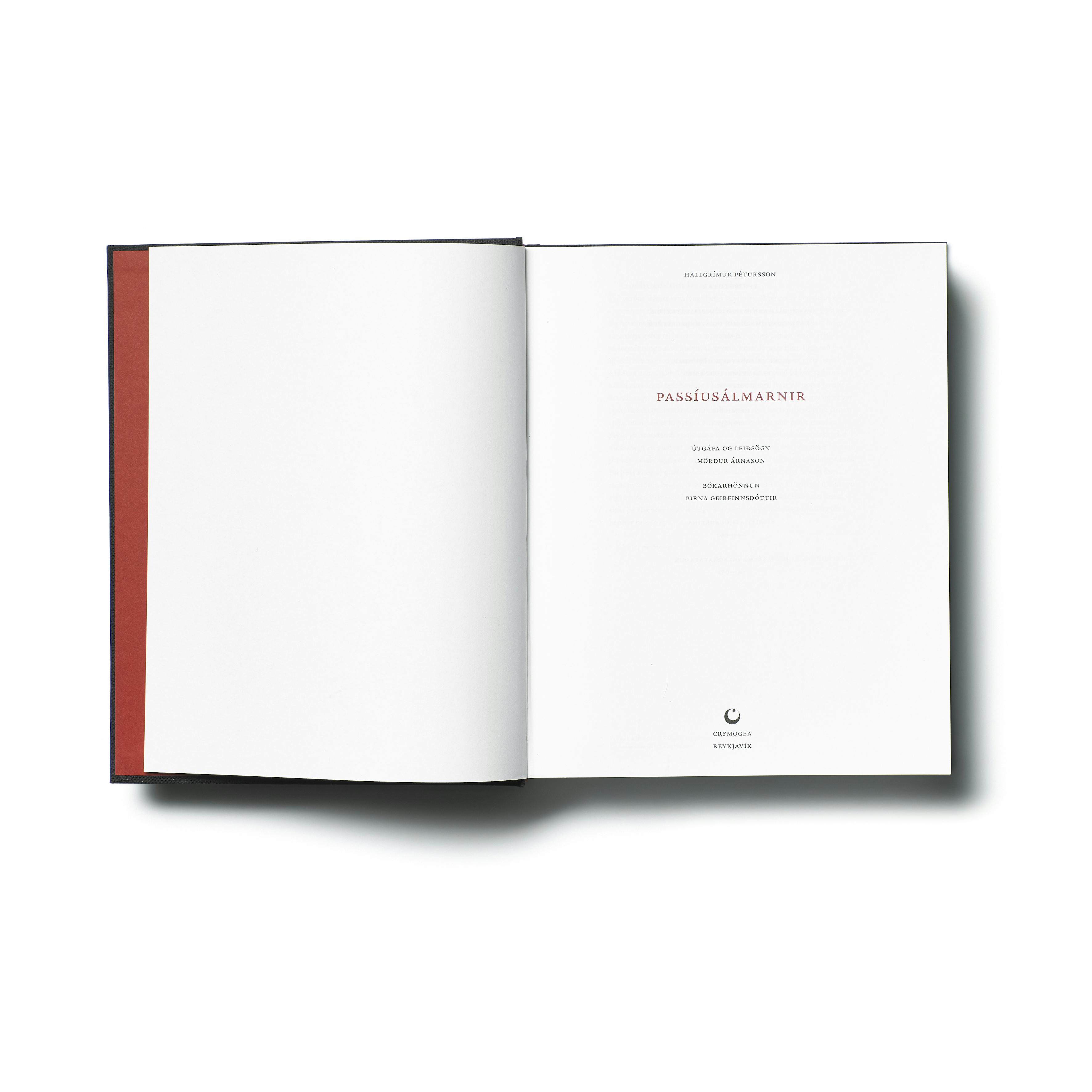
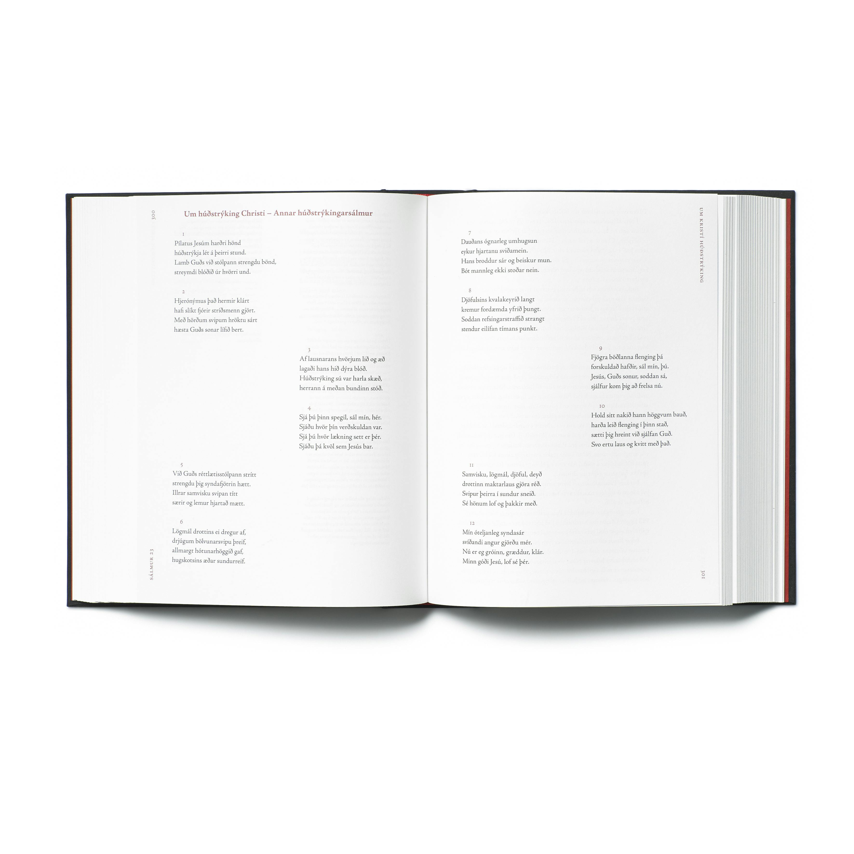
The collaboration began with a thorough conversation, and the preparation and work on the book itself lasted for about a year and a half. “We knew Ragna’s work and that there was an interest in publishing a retrospective,” says Arnar. “When the wheels had been set in motion, we gained access to her photo archive and organised her career into eleven categories, thematically rather than chronologically, in close collaboration with the artist.” The material spans 33 years of Ragna’s career, so it is safe to say that it was a big undertaking. “Work of this type is always very rewarding, when we can participate from beginning to end and where all participants partake in an active dialogue and are invested in the project,” says Arnar. “Complex typography, where one works with multi-layered and complicated content, is also very rewarding,” adds Birna, and refers to their design of ‘The Passion Hymns’ by Hallgrímur Pétursson (1614–1674), edited by Mörður Árnason and published by Crymogea in 2015.
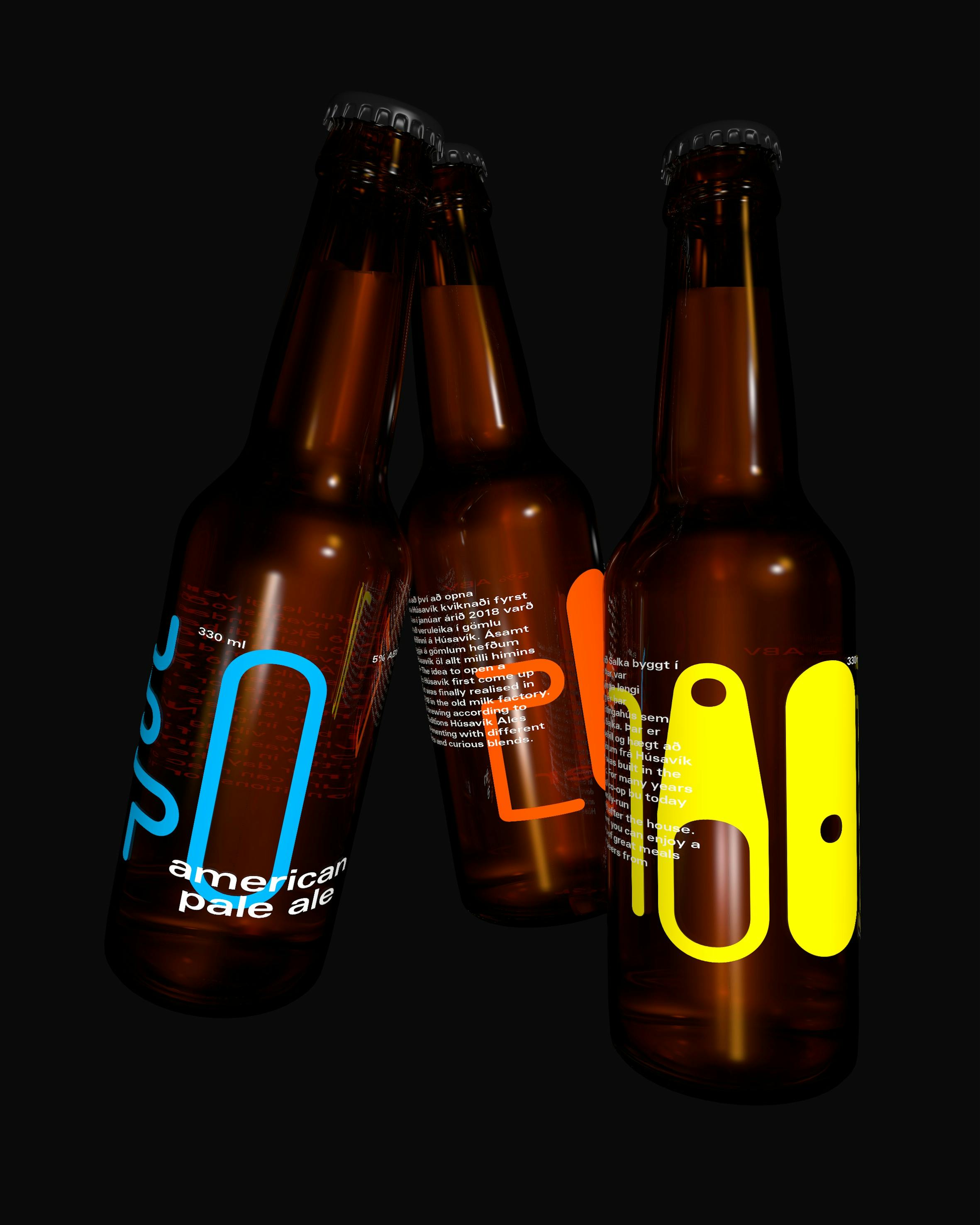
“We work with many other designers and illustrators. A few projects have been centred around specialised font designs and then we have collaborated with font designers,” says Arnar and mentions projects for Húsavík Öl and Svavarssafn Art Museum as examples, where in both cases Studio Studio worked with font designers at Universal Thirst. “The execution of the Húsavík Öl typeface became more illustrative and many of the characters more abstract,” Birna adds. “With Svavarssafn we wanted the typeface to reflect the opposites in Svavar Guðnason’s visual world, so its form structure became quite unconventional, where different worlds of forms are spliced together.”
Somehow the book lasts longer. For example, if I visit a website that hasn’t been updated for a long time, I start thinking that nothing is happening there – it’s dead. But the book never changes.
The finality of print
“We always try to find the appropriate medium for the information we are working with, and sometimes it happens that a book isn’t the chosen medium,” explains Birna.
They emphasise the importance of print in the age of digital media. “Our feeling is that there is more finality in print. Texts that appear online can easily be edited and updated – the text remains open – but to change what has already been printed is much more difficult. However, both mediums are equally important,” says Birna, to which Arnar adds: “It’s interesting with time. Somehow the book lasts longer. For example, if I visit a website that hasn’t been updated for a long time, I start thinking that nothing is happening there – it’s dead. But the book never changes. Even though the content may be outdated, I never think of it as being dead.”
